Email Best Practices
It is estimated that 77% of emails are opened on a mobile device, so it is recommended to design emails "mobile first".
Subject Line & Preheader
- Use a short, informative subject line. It should be fewer than 50 characters in order to be read on mobile devices.
- Select a “From” name and address appropriate to the audience. Consider that students may not know the names of university officials so it may be better to say “Office of…” and use their office’s general email address as the sender so that it matches.
- Include the call to action or purpose of the email in the Preheader text field. The copy should be 100 characters or fewer. It is not required, but email service providers that show preview text will indiscriminately use the first few lines from the body copy if it is not included.
Layout & Content
- Save header/banner images at 600px horizontal. Design the content area of the email to be 600 pixels wide, but accommodate desktop users by centering the content area on either a white or solid color background. It should be set to scale responsively down to 300 pixels for mobile phones.
- If possible, design the email as a single column.
- Keep sentences and paragraphs short. Make use of bullet points, bold typeface and headers to make the content readable.
- Clearly indicate links in the body with underlines and by making them blue. It is recommended that your email has one central call-to-action. If the button for the call-to-action is a link, make sure to provide space around it for people to click.
- Use spacing and horizontal rules to delineate content sections.
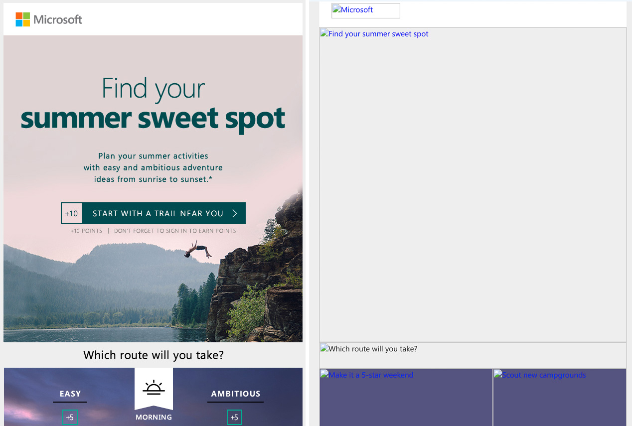
- Minimize the use of images and do not send an email that only contains images. Most email service providers will not load images automatically, so by default, most users will see a blank space. If an image is used, alt-text should be provided. Avoid designing emails with text layered over a background image. Most email clients will not accommodate background images, so the entire section will have to be saved as an image.

Style
Use standard, web-safe fonts as much as possible, e.g., Arial, Georgia, Tahoma, Times New Roman, Verdana, etc. You can use non-standard fonts, but a comparable web-safe font should be set as fallback. It is best not to use our branded fonts outside of images because they will not render for most users. For accessibility, the ideal font size for body copy is 14 pixels, and 22 pixels or larger for headers.

