Perceivable Solutions
Perceivable solutions make it easier for users to SEE & HEAR content. The WCAG guidelines in the Perceivable principle are highly relevant for digital content. Specific accessibility issues relating to this guideline are explained below.
Learn More About WCAG and the Perceivable Principle
ALT TEXT
DEFINITION:
ALT TEXT is detailed, hidden information for screen reader users that explains what images look like.
TIPS:
- Writing alt text is necessary only when images add additional meaning. Often, common platforms such as newer veresions of Microsoft Office programs will have a checkbox to mark if an image is considered "decorative".*
- Write it yourself; Some platforms are now using machine learning to generate alt text but is often misleading and inaccurate. Custom text is always preferable.
- Be succinct but specific. Leave out “Image of…” or “Picture of…” since the screen reader will announce that it is an image.
- Every word you type will be read by site-crawlers and add SEO benefits
- Right-click on an image in most platforms to reveal "alt text" or "image description" options

EXAMPLES:
Accessibility is CONTEXTUAL- write your alt text according to what the image is meant to convey in its context. Take a look at the different alt text options below, all based on CONTEXT.
- Alt-text with no context might read: "A mostly empty stadium".
- Alt-text on a page about recent turnout for track tryouts: "Harvard Stadium with two lone runners bounding up the steps".
- Alt-text on page about renovation projects: "Harvard Stadium with cracked concrete pillars".
- Alt-text that is machine-generated: "place outside"
TECHNICAL TIP:
*If the image provides no additional meaning, the alt text can be entered in the code as (alt=""). This is often referred to as "empty" or "null" alt text.
CAUTION: Do not include a space between the quotation marks.
additional information:
COLOR CONTRAST
DEFINITION:
COLOR CONTRAST is ensuring that FOREGROUND TEXT color is contrasted by ADJACENT BACKGROUND color by a ratio of at least 4.5:1, as per WCAG guidelines.
TIPS: 

- Choose background and font colors wisely.
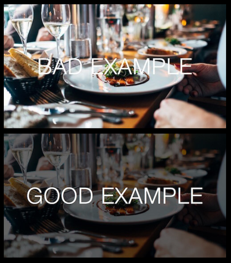
- If you must do a background that is entirely an image, choose one without too much color variation. You can also choose to darken/lighten the image or put a translucent overlay to increase contrast with the text.
- ALWAYS have accompanying text for anything indicated by color. Not just "Tri-Towers data are purple".
- Use bold, sans serif fonts with strong color contrast whenever possible.
- After choosing wise colors and fonts, enlarge text within background whenever possible to ensure readability.
EXAMPLES:
- If you must use a busy, photographic background, add an overlay or drastically change the brightness/contrast of the image so the text stands out more.
- For text posts, Facebook offers several colorful and decorative backgrounds. Make sure to choose a dark solid color. The backgrounds with lots of detail and those with gradient may make your posts difficult to read.
TECHNICAL TIP:
TEST your color/image choices. If you haven't figured this out yet, YOUR own visual evaluation of readability isn't enough to guarantee a good experience for EVERY user. Many products exsit to test contrast, both as browswer plug-ins and applicaitons. The Digital Accessibility team regularly uses the Colour Contrast App.
CAPTIONS & TRANSCRIPTS
DEFINITIONS
- CAPTIONS & TRANSCRIPTS provide a way to interact with content without relying on spoken words.
- CLOSED captions can be turned on and off by the user and are considered preferable to OPEN captions, which are static on the screen and often hide important visual elements.
- A FILE OF CAPTIONS and their time stamps are usually in the .srt format and can be uploaded to many websites and social media outlets to accompany your videos.
- TRANSCRIPTS are text files of every word spoken on the video and also could contain explanations of things that are happening on screen that are relevant to the content.
 TIPS
TIPS
- Ninety-two percent (92%) of users now watch online videos with the sound off, making captions essential for communicating information by video.
- For any large, LIVE, streaming event hosted by the university, a hired captioner is recommended. While the quality of machine-generated captions is improving, current accuracy is not compliant.
- Captions created by live captioners cost money but will ensure higher accuracy. Contact Student Accessibility Services for more information about vendors.
- Use Kaltura REACH to caption any PRE-RECORDED university video - all KSU employees have pre-paid accounts with Kaltura.
- Kaltura will provide a separate, machine generated caption file which you must review and edit for accuracy before uploading with the video. This file will have a .srt extension and can be uploaded to Facebook, Twitter, Instagram, You Tube, and many others.
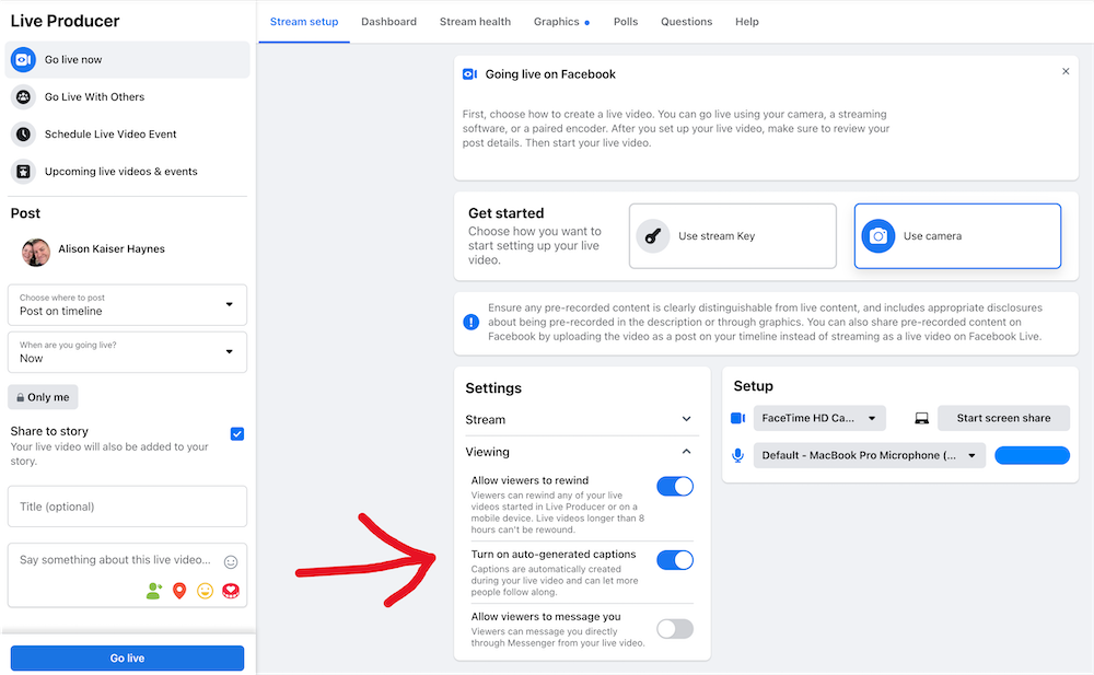
- Often, closed captioning must be enabled on the presenter end. Research your platform (Canvas, Kaltura, Facebook, Teams, etc.) beforehand to learn how to turn on that option for your viewers. Show them how to activate it as part of your event introduction.
- Include a transcript on each page/post that has video. You can upload it independently and have it hyperlinked directly below the video. Learning and retention DRASTICALLY INCREASE when transcripts can be read as supplement to the recorded video.
- Often, closed captioning must be enabled on the presenter end. Research your platform (Canvas, Kaltura, Facebook, Teams, etc.) beforehand to learn how to turn on that option for your viewers. Show them how to activate it as part of your event introduction.
EXAMPLES
- REAL-PERSON CAPTIONING or prerecorded videos with EDITED CAPTION FILES are best practices. Otherwise, you might end up with embarrassing captions!
TECHNICAL TIP
.SRT files can be problematic if not generated by good software or through a good platform. Best practice: always use Kaltura REACH to generate your caption file. The Kaltura interface for editing and downloading is user-friendly and dependable.

SOCIAL MEDIA SPECIFICS
FOR KENT STATE SPONSORED LIVE EVENTS HOSTED ON SOCIAL MEDIA
- Always have captioning available for any KSU sponsored marketing/information/event.
- Announce at the beginning how the captioning can be activated and iterate your unit or KSU’s commitment to accessibility. (We can share verbiage with you!)
- If event has large viewing potential, hire an ASL (American Sign Language) interpreter.
- Even for “smaller” events, choose to make a statement by scheduling an interpreter.
- INTERPRETER CLARIFICATION: If a Deaf user/s make a request, or if you' host a large event where Deaf people might attend, you'll want to use certified interpreters. If it's a medium-sized audience and there aren't requests, Prof. Jamie McCartney’s students are a great, free option.
ADDITIONAL SOCIAL MEDIA ISSUES

All of the POUR guidelines have techniques that are needed in social media. In addition, be aware that two of the most used features of social media often contribute to inaccessibility: EMOJIS and HASHTAGS.
the problems
- Screen readers read the whole description of the emoji: "Excited face with money symbols for eyes and stuck-out tongue". Every emoji has a long label, so this becomes very tedious for listeners.
- Hashtags can be very hard to interpret by both eyes and ears, which defeats the purpose of recognition and marketability.
best practices

- Use emojis and hashtags IN MODERATION.
- Put them AT THE END of a post.
- If you have a CTA (call to action- something you are hoping the user will act upon), make sure it is BEFORE emojis or hashtags so it has a better chance of being heard by screen reader users.
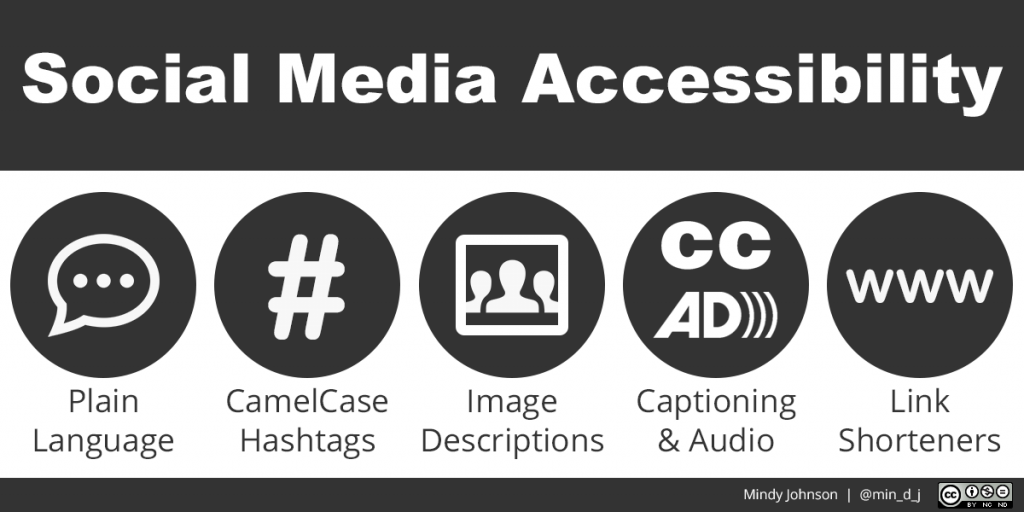
- Always capitalize the first letter of each word in a hashtag for better readability. This is called sentence or camel case.
